

This is relevant to my interests.
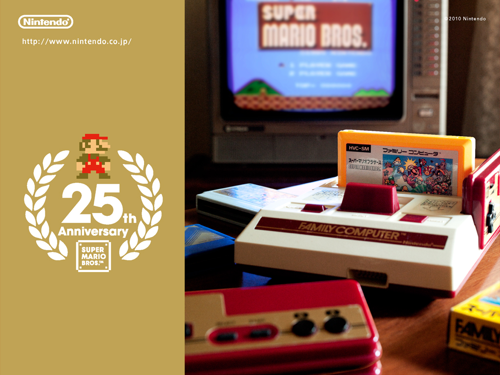
Wallpaper fom Mario's 25th Anniversary - Isn't it lovely?
If you haven't picked up on it yet, I'm a bit of a fan. The Famicom is this blog's namesake, and did a lot of really cool things that the US market never got to see. But we're not here to talk about the Famicom, we're here to talk about this GBA SP.

So cool.
This Game Boy Advance SP model was released to coincide with the release of several Famicom titles on the GBA, known as the "Famicom Mini" series. The US got a very similar release in the form of the "Classic NES" series, minus Star Soldier and Mappy. The US also got an NES-styled Game Boy Advance, the "Classic NES Limited Edition", as shown at the bottom. Same thing, different market.

I love this thing.
It's hard to capture the colors properly, but it's lovely. The red/pearl style is eye-catching even to someone who doesn't have a clue what it's modeled after - I used to get comments often while playing in public. It's aesthetically awesome.
In terms of practical use, though, it's exactly the same as any other Game Boy Advance SP. But hey, mine's way prettier than yours.
No comments:
Post a Comment